Selected Screens
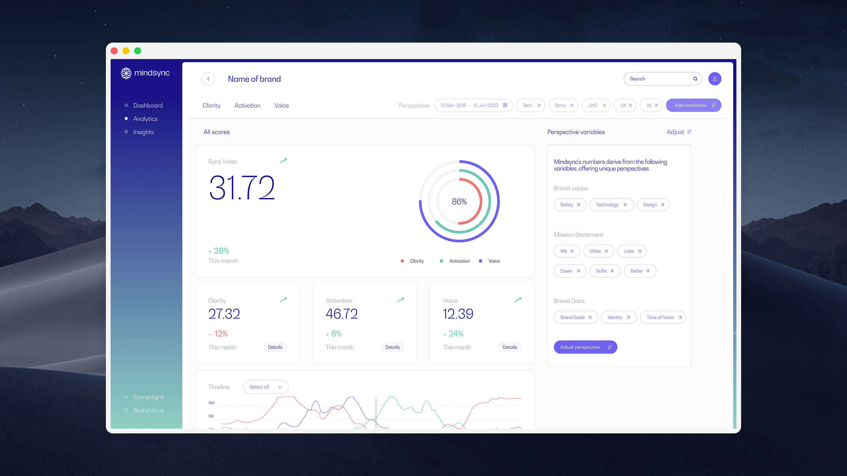
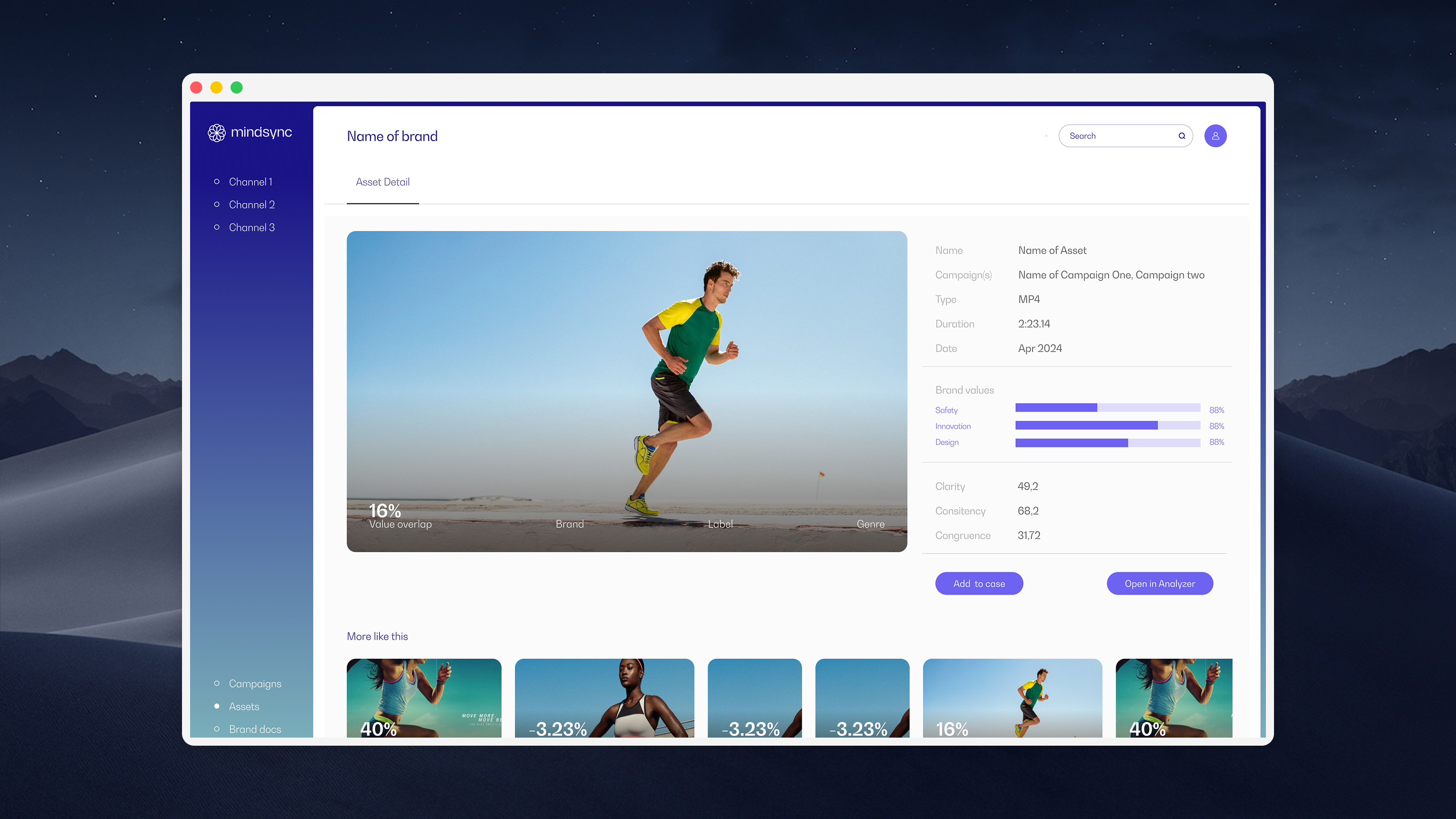
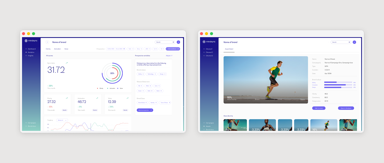
MindSync is an Amsterdam-based AI brand intelligence platform built for brand strategists, creatives, and media teams. Where traditional market research measures what people say or feel, MindSync analyses what communication itself actually signals, using psychometrics, NLP, and consumer psychology to determine whether a campaign aligns with brand identity, drives the right emotional responses, and holds up against competitor messaging. Clients include Philips Avent, Publicis, and a range of Dutch and international brands.
The previous designer had left mid-project with no handover. Engineering was still building, but the product's UX logic had fragmented: each of the four areas, Onboarding, Dashboard, Media Library, and Asset Analyzer, had developed in isolation, with inconsistent navigation patterns and no shared interaction model. Onboarding didn't prepare users for what the platform asked of them. The dashboard collected data without hierarchy or direction. The media library and asset analyzer were functionally separate when they needed to work as one flow.
Two months, no context transfer, a live engineering team. The job was to find the seams, close them, and ship.
I ran the product through a structured heuristics review and mapped the existing IA from scratch. No documentation existed, so understanding what was there required moving through it the way a new user would. The fragmentation became visible quickly: the four areas each had their own navigation logic, and the transitions between them broke the mental model at every handoff point. The clearest finding was the absence of guidance, users had no way to understand where they were in the process, what had been configured, or what the AI had already analysed. In a product that runs as a continuous learning loop, that gap undermines the core value proposition.
The redesign had three interconnected outputs: a staged onboarding flow that configured brand profile, communication goals, and first asset upload in sequence, explaining what the platform needed and why; a dashboard layout framework that defined the hierarchy above the fold (brand health signal, recent scan results, active alerts) and how a user navigated from overview into a specific campaign; and a unified media library and analyzer where the player and psychometric output lived in a single view, so the insight was always anchored to what triggered it. Engineering had a clear UX foundation to build from and could continue feature development without the fragmentation getting worse.
"In a product built around continuous AI learning, the biggest UX problem wasn't the interface, it was the absence of guidance at every handoff."