Engyon · Rotterdam · 2025

AI Audit
Management
Platform

Role Product Design Lead
Duration Jul–Oct 2025
Scope SaaS, B2B, Audit Tech, CSRD
SaaS B2B Audit Tech Design System
09
1.0
0.55
22.0
12.0
0.35
0.12
0.055
0.5
0.008
drag to reposition · double-click to reset
€1M
Seed funding raised
15
Accounting firms in closed beta
3
levels / Office → Audit → Audit Parts
4 months
Full redesign + design system

The Challenge

Engyon is a Rotterdam-based startup building AI-powered audit management software for the era of mandatory sustainability reporting. Founded in 2024, they raised €1M in seed funding in early 2025 and validated their platform in a closed beta with around 15 accounting firms across the Netherlands. Their timing is sharp: the EU's CSRD legislation has created an entirely new category of audit work, and the incumbents, tools built for financial audits, simply weren't designed for it.

The platform serves two primary user types: partner-level auditors at SME accountancy practices, and RAs (registered accountants) who manage ongoing audit dossiers for multiple clients. The core job-to-be-done is audit case management, tracking the progress of an engagement from kickoff through to sign-off, with AI running underneath to automate checks, flag anomalies, and surface relevant controls. The product is structured across three levels: the Office view (Kantoor), where a firm sees all active engagements; the Audit level, where a specific client dossier lives; and the Audit Parts level, where individual sections and tasks are completed.

When I came in, the product had been built almost entirely from an engineering perspective. The team was sharp and moving fast, but the design hadn't kept pace with the product's growing complexity. The dashboard was fragmented across the three levels with no consistent logic tying them together. Users couldn't tell at a glance what was done, what needed attention, or where they'd left off. There was no sense of guidance or forward momentum in the interface. The visual execution made it worse: the dark mode treatment relied on glowing shadows and high-opacity overlays that looked more like a gaming UI than a professional audit tool. For RAs spending hours in this interface managing client dossiers, it was tiring to look at and hard to parse.

I ran several deep-dive sessions with the founders, using real audit dossiers to trace how a partner-level auditor would move through an engagement from start to finish. I paired that with a structured heuristics review against Nielsen's 10 heuristics, marking every violation I found. The broken paths and inconsistent menu patterns showed up quickly. More importantly, the sessions surfaced the single biggest missing thing in the design: progress visibility. Auditors had no reliable way to know how far through an engagement they were, what had been completed, and what was still open. In a workflow built around completion and sign-off, that's a fundamental gap. The synthesis was clear: the design needed to communicate state and guidance, not just display data.

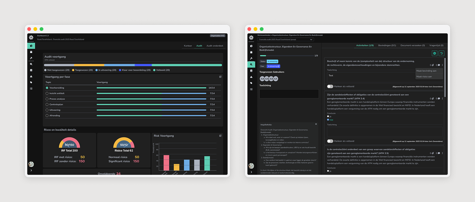
The design system we established defined a clear elevation model: background layers, surface layers, and interactive/highlight layers with defined colour values and shadow rules, giving engineering a shared visual language to apply consistently as they continued building. The dashboard redesign focused on hierarchy and completion state: horizontal progress bars showing completion at a glance, KPI cards surfacing the metrics that matter for triage, and a gauge component communicating overall engagement health without mental arithmetic. Broken journeys were catalogued and fixed systematically. These weren't glamorous fixes, they were the difference between a tool RAs could rely on and one that quietly eroded trust every time they hit a dead end.

Four-Phase Redesign

01
Heuristics & Discovery
Ran structured heuristics review against Nielsen's 10 principles alongside deep-dive sessions with founders using real audit dossiers. Mapped every broken navigation path, inconsistent menu pattern, and dead-end link. Identified the critical missing design element: progress visibility across all three levels of the product.
02
Colour & Elevation System
Replaced the ad hoc dark mode treatment with a coherent elevation model: background layers, surface layers, and interactive/highlight layers with defined colour values and shadow rules. Gave engineering a shared visual language applicable consistently as the product continued to grow.
03
Dashboard Redesign
Redesigned the dashboard hierarchy for all three product levels (Office, Audit, Audit Parts) with a consistent approach to completion state. Horizontal progress bars, KPI metric cards for triage, and a gauge/speedometer component for overall engagement health, no mental arithmetic required.
04
Broken Journey Repair
Catalogued and fixed every dead-end link, contradictory navigation pattern, and context-breaking menu behaviour found during discovery. Systematic rather than selective, the full set of breakages that had accumulated during fast feature delivery.
05
Component Library
Structured updated Figma components to support Engyon's AI-assisted development workflow (Lovable, Cursor, Gemini). Clean naming, defined states, token-based styling, designed to feed directly into AI-assisted development without significant translation loss.
06
Handoff & Continuity
Delivered design documentation structured for an engineering team building fast on AI tools. Every component, state, and pattern documented at the level of precision required for Lovable and Cursor to generate consistent output, ensuring design quality could persist without a designer in every sprint.

My Role

1 UX Audit & Research, Conducted structured heuristics reviews and deep-dive sessions with founders using real audit dossiers to trace actual auditor workflows. Built a complete picture of every broken path and missing state in the product before designing anything.
2 Design System Foundation, Established the colour and elevation model that replaced the ad hoc visual approach. Defined background, surface, and highlight layers with documented values, the infrastructure that let engineering apply design decisions consistently across the product.
3 Dashboard Redesign, Redesigned the information hierarchy and completion state communication across all three product levels. Designed the progress bar system, KPI card components, and gauge/speedometer for engagement health that gave auditors the progress visibility the product was missing.
4 Journey Repair, Catalogued and resolved every broken link, contradictory navigation pattern, and dead-end flow found during heuristic review. Systematic approach to restoring the foundational trust that had been eroded by fast feature delivery without UX oversight.
5 AI-Ready Component Library · Structured Figma components with clean naming, defined states, and token-based styling specifically to support Lovable, Cursor, and Gemini in the team's AI-assisted development workflow. Design feeding directly into code generation without translation loss.
Context Rotterdam startup, €1M seed-funded, building AI audit management for the CSRD era. Closed beta with 15 accounting firms across the Netherlands.
Stack Figma, Lovable, Cursor, Gemini, Miro, Creatie, Perplexity.
Outcome Updated visual system, fixed UX foundation, and a design library engineering could build from. Product now in broader rollout with EU expansion on the roadmap.
Selected Screens
Audit monitoring · engagement progress
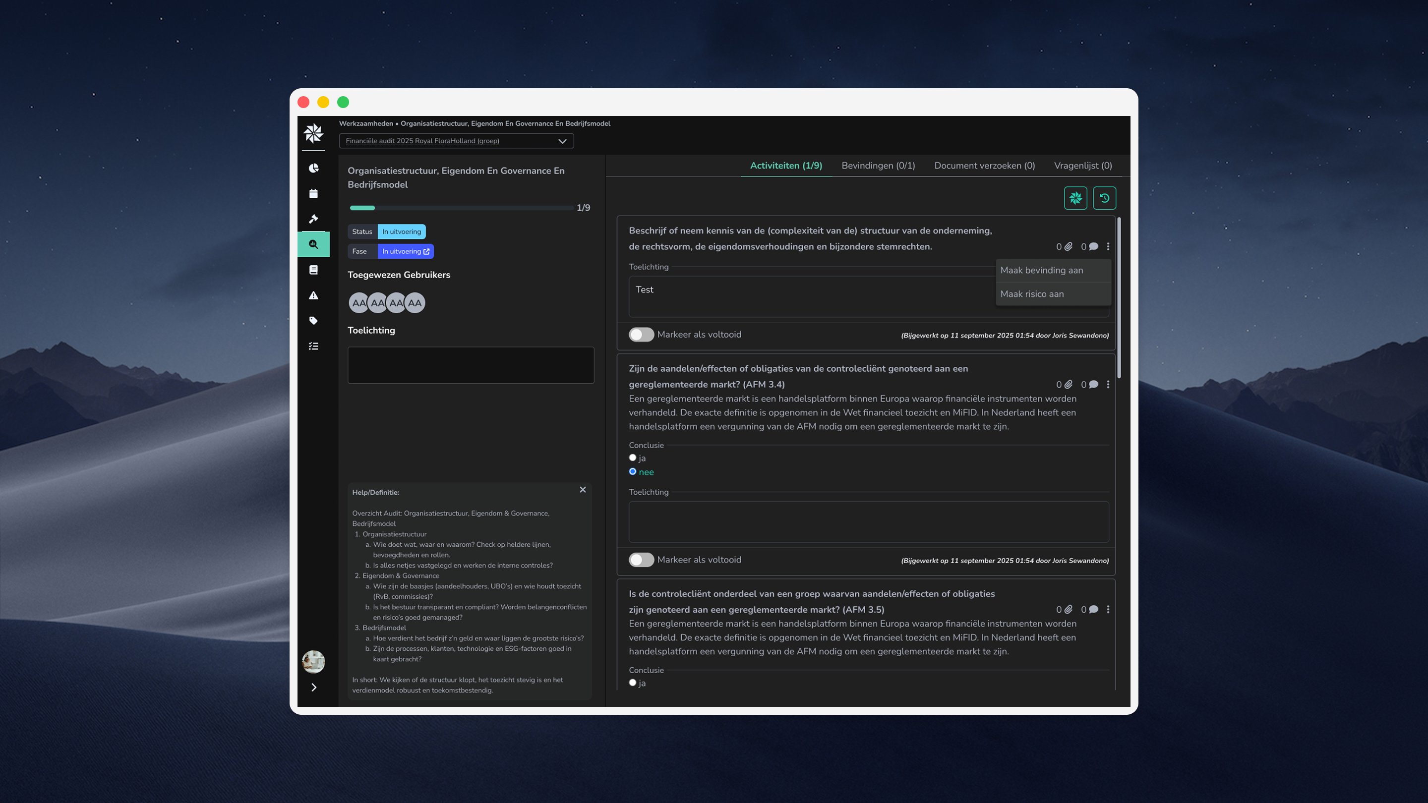
Audit workspace & review flow

Outcomes & Impact

3
lvls / Progress visibility established across Office, Audit, Audit Parts
4 months
Full redesign from heuristics to component library
15
Accounting firms in the beta the platform now serves
0
Dead-end links and broken journeys remaining
"In audit software, the interface's job is to make completion feel inevitable, not optional."
Previous Project
TLM42 Threat Intelligence
Next Project
EII Analytics Suite